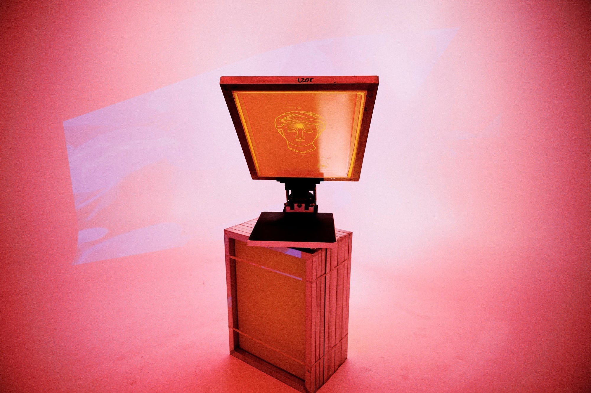
Pantone Colour Guide for Screenprinting.
Colour is everything in screenprinting. It defines a brand, creates emotion, and makes your merch stand out.
At madebyplasma, we understand how crucial colour consistency is, whether you’re producing 25 or 25,000 garments. That’s why we created the madebyplasma Pantone Colour Matching Guide — a resource to help you choose, match, and reproduce colours with precision across every print run.

What is Pantone Colour Matching?
The Pantone Matching System (PMS) is a universal colour language used by printers and designers to ensure colour consistency across every medium — from digital art to fabric printing.
When you give us your Pantone Solid Coated colour code, we can replicate that exact shade by mixing inks to Pantone’s formula. This ensures your:
- Brand colours stay true and consistent across multiple orders.
- Designers and printers speak the same language, reducing guesswork.
- Final prints match your brand identity, no matter what garment or technique you choose.
Whether you’re printing on organic cotton tees, heavyweight fleece, or technical activewear, Pantone matching ensures your colours remain accurate every time.

How We Mix Pantone Colours at madebyplasma
- Weighing and Mixing Inks: Using Pantone-certified base colours for the most accurate match possible.
- Print Testing: Running a colour strike on the actual garment to ensure the ink reacts correctly to the fabric.
- Final Adjustments: Fine-tuning by eye and touch to achieve the perfect hue and opacity.
- Recording the Formula: So your exact colour mix can be reproduced consistently in future runs.
About Our Pantone Colour Matching Guide
- Identify the most commonly used Pantone colours for screen printing and embroidery.
- Understand how different inks (water-based, discharge, plastisol) can influence colour results.
- Communicate colour expectations clearly with our design and production team.

Why Colour Accuracy Matters in Screenprinting.
From your logo colour to your garment print, consistency tells your audience that every detail matters.
The madebyplasma Difference
- Experienced Printers: 55+ years of combined industry experience across screenprinting, embroidery, and colour management.
- Premium Inks: We use high-opacity, Pantone-certified bases for bold, accurate results.
- In-House Control: All colour matching, testing, and approvals happen right here in our Gold Coast studio.
- Sustainable Practices: Our water-based and discharge inks are eco-conscious while maintaining premium colour performance.
Download the madebyplasma Pantone Colour Matching Guide.
Download our Pantone Colour Matching Guide to start your project with clarity and confidence. Inside, you’ll find colour reference swatches,


